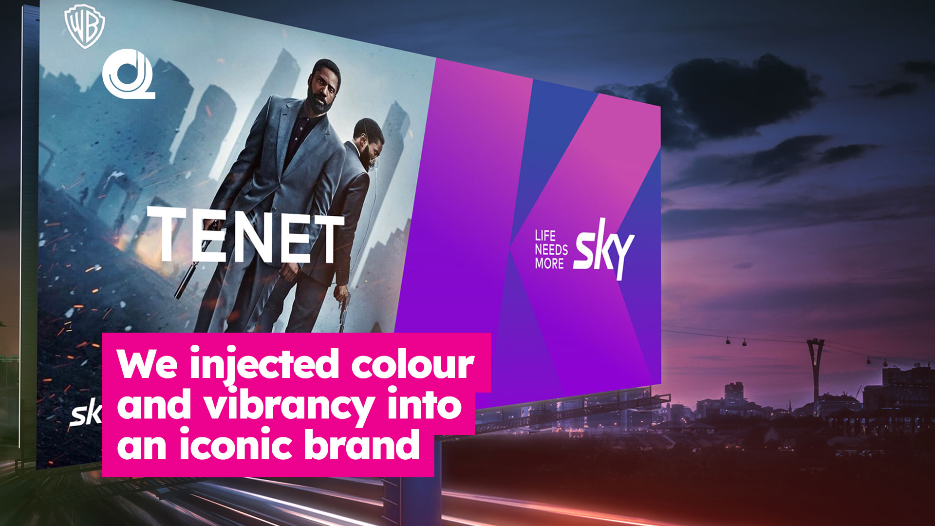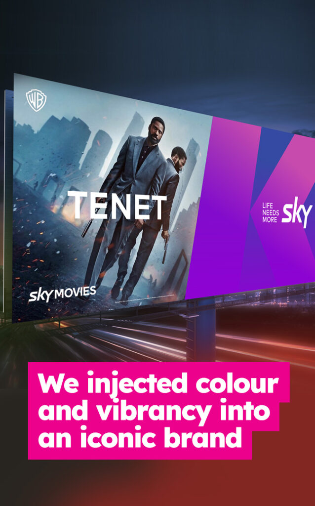

Faced with a need to compete with the big global streaming platforms moving in on New Zealand, there was a desire to freshen up the Sky brand.
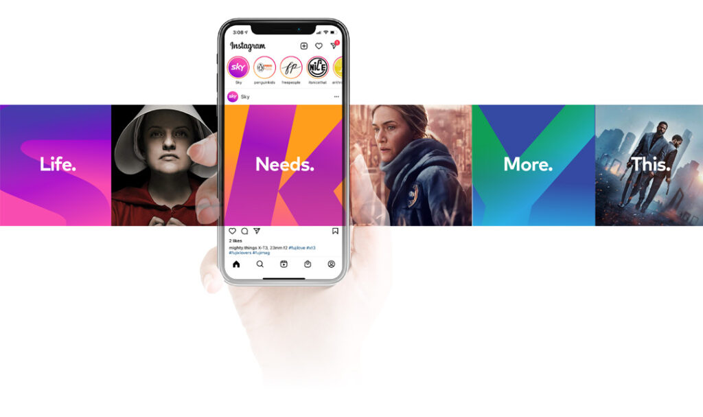
We stepped in, true to our philosophy, to bring together lots of streams of great development work from different sources, which were not quite working. We harmonised these work streams, simplified colour palettes, crop concepts and layers of visual complexity to create a simple, striking visual style which has quickly been adopted by the business and adopted by all, and set it up on digital asset platform Frontify so easy to access and update.


